Maps are guided by power, not truth

Navigating the future with critical cartography

We look to maps for guidance, helping us to navigate the world as effectively as possible. But are maps as neutral and objective as we think? Cultural geographer Mike Duggan argues that what goes on the map – and who decides – has a significant impact on our lives that we often don’t notice.


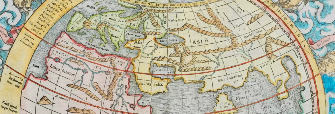
In the popular TV show The West Wing, White House Press Secretary C.J. Cregg and Deputy Chief of Staff Josh Lyman have their minds blown after it is revealed to them that maps can distort real geographies. After being shown a Gall-Peters projection map, where the map more accurately represents the real size of countries compared to the older and more popular Mercator projection map that we are all accustomed to, both are visibly dismayed at the notion that Greenland is not as big as they thought, actually fourteen times smaller than Africa despite appearing comparable, and that Germany was in simply the wrong place.

Maps claim to show a view from nowhere – an objective view of the world, and yet the Mercator projection is map with Europe at is centre and European interests at its heart. There is nothing natural about this perspective, but still it has become normalised.As philosopher Donna Haraway famously asserted, scientific claims, which include maps, are presented as if they are universal truths, rather than ‘situated knowledges’ produced by people who can only ever offer a partial view of the world. As mapping creeps into ever-increasing domains of human consciousness though our interfaces with map-enabled digital apps, we should be more mindful than ever that maps aren’t neutral. We should keep in mind that the Mercator projection is a product of western cartography, designed to amplify western power. It certainly does not represent how all people and cultures see the world.

AdobeStock 243858276 Converted SUGGESTED READING Mapping the illusion of reality By Rasmus Grønfeldt Winther

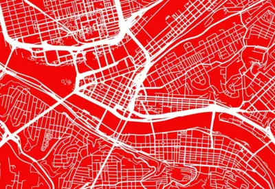
The idea that maps reflect the world views of their makers – and in turn that maps have the power to shape public perception and opinion – was first laid bare by academics such as Brian Harley in the 1980s, who set the stage for a generation of ‘critical cartographers’ to unpick the details of maps and highlight where their power lies. Hundreds of studies have picked apart all kinds of maps to decode their power, from road, rail and street maps to urban plans, sea charts, strip maps, rock carvings and much more. Take street maps, for example, which claim to show us the details of our neighbourhoods. Studies show these are not objective; instead, they are carefully designed using colour, text, font, and symbols to give us the impression of neutrality. How parks are shown on these maps is a case in point. Painted in green, they appear inviting, neutral, and safe, when in fact parks are highly contested and dynamic spaces, changing depending on the time of day or year, or when different people occupy them. Street maps give us no indication of these dynamics, which are important factors people consider when going to a park. 

___

The expertise of the cartographer lies in their ability to make selective representations of the world, not to reproduce it.

___

The power that maps have to shape our behaviour has only grown further since digital mapping technologies have flooded the market and become essential for many of us as we navigate our daily routines. In many ways this power has been consolidated through the force of big tech platforms, the value of location-based data, and the allure of playful map design that directs our attention away from what is and isn’t shown. The world’s most popular map, Google Maps, exemplifies this. This is a map produced for commercial purposes – it is not a public service - and what is included and not included on this map reflects this. The map prioritises use that generates valuable data for them, which can then be used along with all the other data Google collects about us to turn a profit. This means prioritising maps with locations that can be linked to spending habits and patterns – type in any place, click through the zoom layers and you’ll quickly see commercial businesses prioritised - and navigation services, which produce vast amounts of mobility data about the minutia of our movements, tracked by GPS. Together this amounts to hugely valuable data, sold as analytics packages to advertisers looking to target consumers, as well as used in other arms of their business such their AI and self-driving operations. Location data drawn from where we are in physical reality as we interact online is a now multi-billion dollar industry, and can be packaged into its own maps for us to access as a product, such as viewing the location of our friends on apps like Snapchat.

The influence of analogue maps has not diminished in this newly digital world: traditional maps remain important objects in our lives in both old and new ways. The iconic Tube map still reigns supreme on the walls and carriages of the London Underground, shaping perceptions of how the city is laid out for Londoners and visitors alike, while ‘You are here’ city maps have found a new home alongside the exponential rise in bike sharing schemes across the world, allowing us to navigate the city autonomously.

Yet despite this, the power of maps remains largely hidden in plain sight, taken for granted, operating quietly and reliably in the background as they support us through a whole range of activities. Even as we are increasingly aware of the power of maps, we are still subject to the naïve assumption of their objectivity. I’ve been studying maps for over ten years, and I still put my trust in maps to tell me where I’m going or to give me an overview of what’s happening where, despite the fact that I know full well that what I’m seeing is a carefully selective perspective on the world.

This selectivity is inevitable: the process of mapmaking is based on the premise that some things are included and others excluded. To include everything on a map would be impossible and render it meaningless for most uses. The expertise of the cartographer lies in their ability to make selective representations of the world, not to reproduce it. This was recognized in a short tale by the Argentine writer Jorge Luis Borges, of an empire that attempted to make a map at exactly the same scale as the territory, only to find that this would ultimately obscure the land on which it was based and render it useless.

___

It’s no accident that Google Maps depicts Taiwan as a separate state from China, and prefers the toponyms of the Gaza Strip and the West Bank over Palestine.

___

Nevertheless, who decides on what to include and exclude, and what that tells us about the world view of those who produce maps are still important questions to ask, especially in world gripped by the power of big tech who continue to find new ways to put cartography in our pockets in order to draw out valuable location data. In order to understand maps, we need to look beyond the map itself at how, why and where certain maps are made, by whom exactly, and the politics and cultures inherent in making and using maps. Most of the maps we use today remain produced by a select group of institutional cartographers, be they government backed national mapping services like the Ordnance Survey, or the commercial behemoths like Google. We need to ask ourselves, what are the interests and politics of these organisations, how is this reflected on the maps that they produce, and how are they situated in broader global perspectives? The ways that mapping companies approach contested borders highlights this. It’s no accident that Google Maps depicts Taiwan as a separate state from China, and prefers the toponyms of the Gaza Strip and the West Bank over Palestine. And it’s no surprise that Apple Maps relabelled Crimea as part of Ukraine to users outside of Russia in February 2022. These are not objective decisions; they are perspectives that reflect a company with particular politics and a company making strategic decisions to protect their commercial interests with a broader public.

When we examine maps with this broader perspective, we begin to see that power does not emanate from the map alone, but rather flows from and through the context of its use. This may, of course, include what’s represented on the map, but equally we must consider the people, politics, cultures and technologies involved in its use.

Maps have the power to influence our perspectives and shape what we do. We see the power of maps through what they represent and for whose gain, but we also can see this power through the capacity of maps to shape the minor moments of everyday life. As map users we should always question this power if we want to develop a better understanding of how they shape our own practices and perspectives.

Latest Releases
Join the conversation